How smart phones have made the web dumb.
by Rich SaundersHow smart phones have made the web dumb.
Is it just me or has the modern web become, kind of boring? I have been fortunate enough to see the web evolve from its early days of finding it's feet with the public to the behemoth it is today. Over time it feels like we have gone full circle. Websites started out simple and functional, then evolved some more depth with multiple pages, navigation and new UI. Eventually we got broadband that gave us internet speeds able to deliver bigger webpages, faster and as a result a boom of creativity in the industry of web design.
Where we started
The very first websites we as basic as they could be, pure function with little in the way of styling and imagery. Restricted by the capabilities of the browser, the languages and of course the speed of the internet. A copy of the very first website is still available today. Even some of the most iconic websites had humble begins, just check out the original Amazon homepage from 1995.

Websites started to get a bit more styling and imagery over time but were still quite limited.
The implementation of broadband
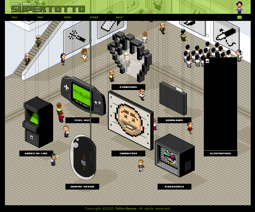
Once broadband landed in the homes of UK residents back in 2000, thing started to change. We had more capabilities with the languages we used as well as being able to serve up more due to faster internet. With this came a new wave of creativity in web design. We went from simple menus to wonderfully interactive sites like Supertotto.
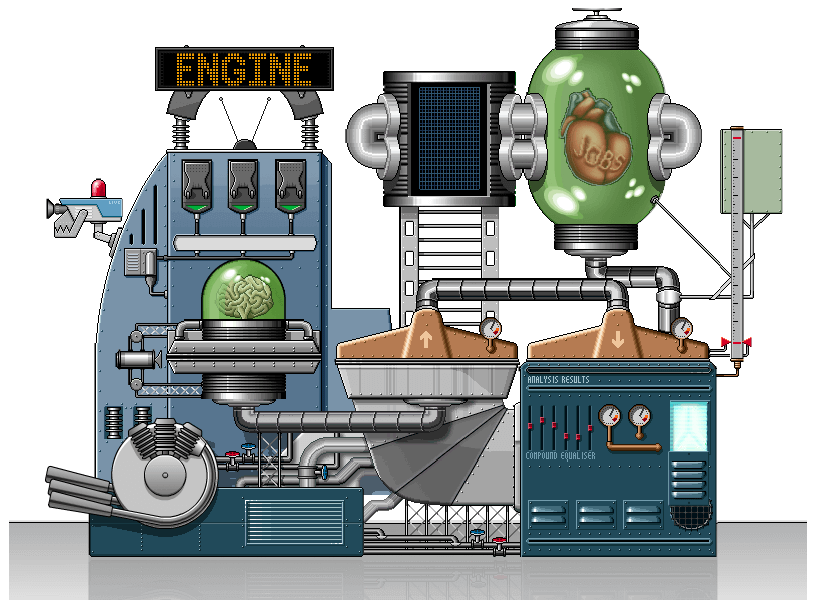
Or maybe even Engine, another example of a creative UI.
If you fancy a nostalgic trip down memory lane then you can find plenty more at the Web Design Museum.
Introducing the smartphone
Fast forward to the year 2007 and you will find the introduction of the iPhone. The worlds first successful smart phone. The sheer popularity of Smart Phones finally allowed users a way to browse the web with ease from their mobile phone and presented a new challenge for web design, how to make websites work well on such a small screen? Well the answer was simple, make a website designed for a small screen and designed to scroll. To start with most companies didn't have a mobile friendly website, nor were they ready to redesign the entire website to be mobile friendly and we ended up with two versions off the same site. Big companies simply re-directed the user to whichever website suited the medium they were using.
The demand for a clean UI
Small screens weren't the only challenge that was faced with the rise of the smartphone. The smartphone also changed how we interacted with websites, mostly influenced by how we had become accustom to easy-to-navigate nature of mobile apps. People no longer wanted websites full of links, graphics. Non-pertinent information often caused users to grow impatient and frustrated quickly. The days of the content driving the design of a website were out and the days of user focused design were in.
Simplistic page layout
As people started designing with mobile in mind and a lot of people started designing mobile first we saw a shift from three column websites to single column websites. Websites with a long, scrolling page of content. The competition was all about who could deliver the most information with the least links and most clarity as well as an elegance and simplicity to the design. Things became very clean.
Clean navigation
Small screens gave a want and need for cleaner and clearer navigation. Pressing a tiny text link with your thumb wasn't easy. App's introduced larger buttons and as we were already getting used to the streamlined look of app navigation we started to demand it from our websites too and in response we got it. It came in the form of hidden elements. On desktop, a navbar along the top of the page. On mobile, a navigation menu that popped up with the press of a button. Some modern websites now simply opt for nothing more than hidden navigation menu, further adding to the simple look of the modern web.
Flat design
Small screens with low resolution made it hard to see the details, shadows and gradients for example. Instead we started looking at bold, clear and punchy designs. It soon started finding it's way onto desktop as well. Long gone was the time of 3D designs and complex designs.
Where we are now
Now? Now I feel we are in a place where the web has become boring. All of these changes may make it easier and simpler to navigate the web but it has also made it boring. It feels like a lot of creativity has been lost behind peoples expectations of how a service should work. For example, you walk into a supermarket, you expect a very similar look to their competitor. I will admit that a lot of things are making a comeback now that the resolution of smartphone has improved, we are seeing subtle shadows, gradients and more re-appearing but the interactivity and creativeness of websites is still lacking. Most websites nowadays look the same, same layout, same design, different branding and different colours but that's another article altogether. In conclusion the web has become basic again, and personally, I feel the smart phone has made the web dumb.